Making Github Traffic Type Plots
 View source on GitHub
|
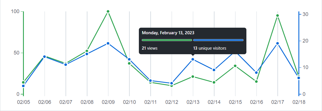
Github keeps several analytics information about every repository. One such information is the Traffic to a repository. This report can be found under Insights => Traffic page. Traffic info for a repo contains two figures. One figure contains both number of clones and number of unique cloners. Similarly, the other figure contains number of views and number of unique visitors to the repo that may look something like the figure below.
In this blog, we will try to reproduce this figure. Though our figure would not be identical to the above, it would be close. We will use plotly library to produce the interactive plot and matplotlib to produce static plot. We will first create some random data that would then be used in the plots.
import numpy as np
import pandas as pd
import plotly
import matplotlib
import plotly.graph_objects as go
from plotly.subplots import make_subplots
import matplotlib.pyplot as plt
import matplotlib.dates as mdates

print("Numpy version: ", np.__version__)
print("Pandas version: ", pd.__version__)
print("Plotly version: ", plotly.__version__)
print("Matlpotlib version: ", matplotlib.__version__)
Numpy version:  1.23.5
Pandas version:  1.5.3
Plotly version:  5.13.0
Matlpotlib version:  3.6.3
data = {}
dates = [f"{item}/2/2023" for item in range(1, 16)]
data["date"] = pd.to_datetime(dates, format = "%d/%m/%Y")
data["views"] = np.random.choice(np.arange(start = 20, stop = 100), size = 15, replace = False)
data["unique_visitors"] = np.random.choice(np.arange(start = 1, stop = 30), size = 15, replace = False)
df = pd.DataFrame(data)
df
| date | views | unique_visitors | |
|---|---|---|---|
| 0 | 2023-02-01 | 68 | 14 |
| 1 | 2023-02-02 | 23 | 8 |
| 2 | 2023-02-03 | 86 | 20 |
| 3 | 2023-02-04 | 63 | 22 |
| 4 | 2023-02-05 | 85 | 18 |
| 5 | 2023-02-06 | 53 | 7 |
| 6 | 2023-02-07 | 35 | 6 |
| 7 | 2023-02-08 | 69 | 23 |
| 8 | 2023-02-09 | 96 | 4 |
| 9 | 2023-02-10 | 52 | 1 |
| 10 | 2023-02-11 | 55 | 21 |
| 11 | 2023-02-12 | 25 | 11 |
| 12 | 2023-02-13 | 92 | 3 |
| 13 | 2023-02-14 | 34 | 2 |
| 14 | 2023-02-15 | 72 | 17 |
# Create figure with secondary y-axis
fig = make_subplots(specs=[[{"secondary_y": True}]])

# Add traces
fig.add_trace(
    go.Scatter(x=df["date"], y=df["views"], name="views",
               marker = dict(size = 10), marker_line_width = 2,
               marker_line_color = "white",
               marker_color = "green"),
    secondary_y=False
)

fig.add_trace(
    go.Scatter(x=df["date"], y=df["unique_visitors"], name="unique visitors",
               marker = dict(size = 10), marker_line_width = 2,
               marker_line_color = "white",
               marker_color = "blue"),
    secondary_y=True,
)

# Add figure title
fig.update_layout(
    title_text="Github style plot"
)

fig.update_layout(plot_bgcolor = "white",
                  hovermode = "x unified",
                  hoverlabel = {"namelength": -1}
                 )

# Set x-axis title and ticks
fig.update_xaxes(title_text="Date", range = [df["date"].iloc[0], df["date"].iloc[-1]],
                 tickmode = 'array',
                 tickvals = df["date"],
                 tickformat = '%m/%d',
                 hoverformat = "%A, %B %e, %Y",
                 )

for item in data["date"].values[1:-1]:
    fig.add_vline(x = pd.to_datetime(item), line_color = "grey")

# Set y-axes titles and ticks
fig.update_yaxes(title_text="views", secondary_y=False, linecolor = "green", linewidth = 3, ticks = "outside")
fig.update_yaxes(title_text="unique visitors", secondary_y=True, linecolor = "blue", linewidth = 3, ticks = "outside")

fig.show()
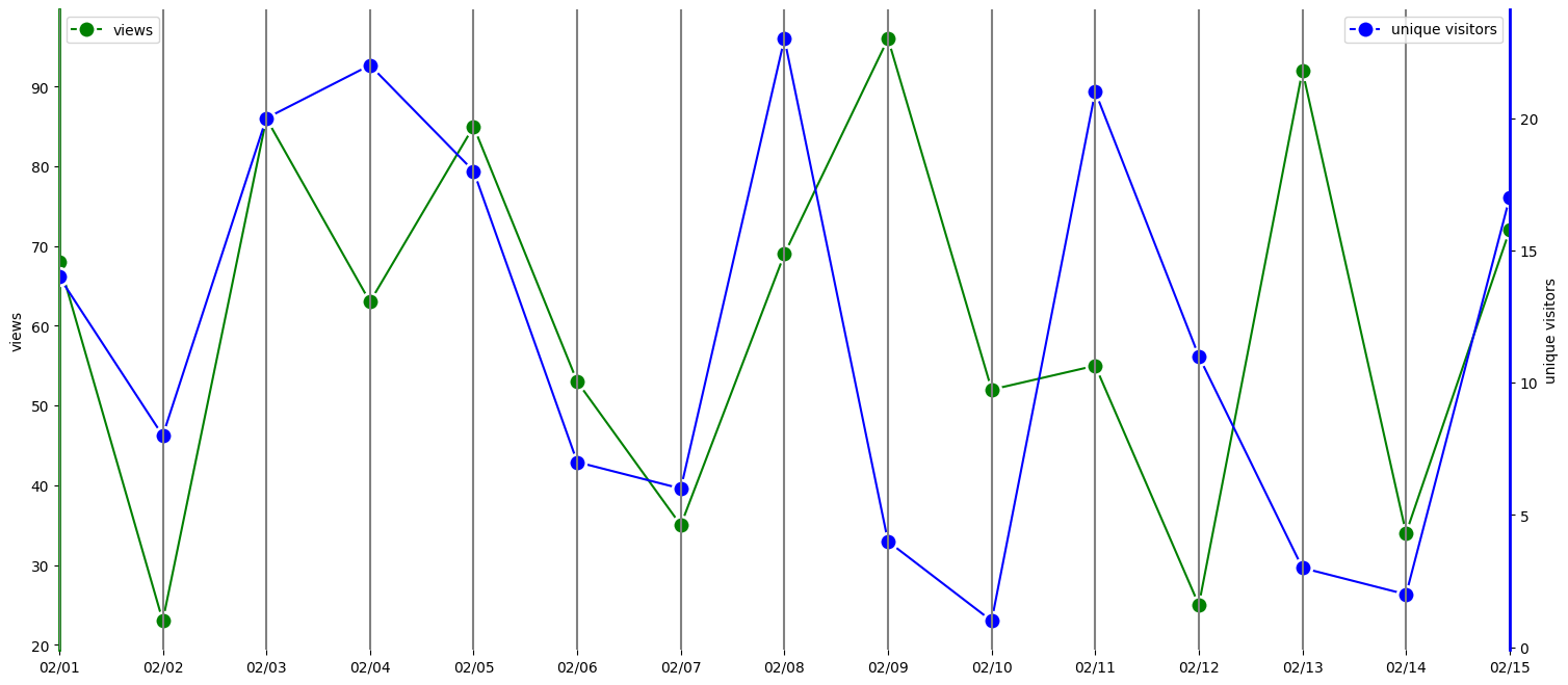
Now, we will try to produce the same plot using matplotlib.
fig, ax1 = plt.subplots(figsize = (18, 8))

marker_style = dict(marker = "o", linestyle='-', markersize=12,
                    markeredgecolor="white", markeredgewidth = 2)

ax1.plot(df["date"], df["views"], color = "green", label = "views", **marker_style)
ax1.set_ylabel("views")
ax1.xaxis.set_major_locator(mdates.DayLocator())
ax1.xaxis.set_major_formatter(mdates.DateFormatter('%m/%d'))
ax1.legend(loc = "upper left")
ax1.spines["top"].set_visible(False)
ax1.spines["bottom"].set_visible(False)
ax1.spines["left"].set_linewidth(2)
ax1.spines["left"].set_color("green")
ax1.spines["right"].set_visible(False)

ax2 = ax1.twinx()
ax2.plot(df["date"], df["unique_visitors"], color = "blue", label = "unique visitors", **marker_style)
ax2.set_ylabel("unique visitors")
ax2.legend(loc = "upper right")
ax2.spines["top"].set_visible(False)
ax2.spines["bottom"].set_visible(False)
ax2.spines["left"].set_visible(False)
ax2.spines["right"].set_linewidth(2)
ax2.spines["right"].set_color("blue")

for item in df["date"]:
    plt.axvline(item, color = "grey")

plt.xlim(df["date"].iloc[0], df["date"].iloc[-1])
plt.tick_params(top='off', bottom='off')
plt.show()